Diagrams Blog | Diagrams

Lukáš Kubánek

Diagrams Changes Its Pricing Model

We have great news for anyone considering using Diagrams as a diagramming tool on their Mac! With the most recent update, version 2.3, we switched the pricing model from an upfront to an in-app purchase. You can now get the app from the Mac App Store for free and test its functionality for 5 days. If you decide that Diagrams fits your needs, you can then unlock the full version via a one-time purchase priced at $22.99 (or the equivalent in your local currency).

The change of the pricing model won’t affect any existing customers. If you previously purchased Diagrams on the Mac App Store, you’ll retain access to all features of the app, and you’ll receive all new updates from the store as usual. The same goes for users who use Diagrams via Setapp.

To learn more about how the trial version works and how to purchase the full version, you can take a look at our updated FAQ page. If you experience any issues with the activation after the update or have any questions in general, please get in touch with us at support@diagrams.app.

Automation and More Flexibility with Diagrams 2.2

We’ve just released Diagrams 2.2, which adds new options for configuring element and relationship types in the palette. It’s ready for macOS Monterey, and it includes initial support for automation with Shortcuts.

New Shapes and Arrows

Since it was first released, Diagrams has only supported basic shapes and arrow heads. When we made the palette customizable earlier this year, all attributes became configurable, but we only added new element colors and text formatting options. To continue our efforts in extending the flexibility of diagram creation, we’re introducing eight new element shapes and eleven relationship heads. You’ll find them in the respective pop-up menus in the palette.

New Shapes and Heads in Diagrams 2.2

By taking advantage of these additions, you now gain the ability to create even richer diagrams. When designing your palette, choose your desired shape for element types, and adorn relationship types with fitting heads at both ends for the perfect arrow.

In addition to specific palettes, there are also generically applicable use cases for these new options. For example, it’s now possible to make a Note appear like a sticky note and a Document appear like a sheet of paper. Diagrams can also get closer to the standards of certain visual languages like flowcharts or UML, as certain object types are now representable. The following overview shows a few examples. To get even more inspiration, you can browse through our updated Examples Library.

Palette Examples

Flowcharts

We refreshed the built-in presets and focused on flowcharts, a very popular diagram type among Diagrams’ userbase. As illustrated above, we made some adjustments to the existing element types and introduced two new ones:

  • Subprocess — Represents a larger, multistep process that is defined elsewhere, e.g. in a separate flowchart.

  • Input/Output (sometimes called Data) — Indicates information entering and leaving the process. This might include user input and UI output in the software domain; or controls, sensors, and displays in the hardware domain.

While these two types aren’t fundamental to most flowcharts, having them at hand allows you to be more expressive, should you have advanced needs. To give you an idea of how they might be used, we prepared a sample diagram:

Flowchart Sample Diagram

Automation with Shortcuts

This year, Apple brought its visual automation system, Shortcuts, from iOS to the Mac. Diagrams 2.2 adds support for Shortcuts by providing three actions for creating and exporting Diagrams documents. Beginning with macOS Monterey, you can integrate these actions into your custom workflows to automate recurring tasks. If you’d like to learn more about Shortcuts, we have an in-depth blog post for you.

Diagrams 2.2 is a free update, and it’s available on the Mac App Store and Setapp. For the full list of changes, you can refer to the release notes. We hope you like these new features!

Diagrams Now Speaks Chinese & German

It hasn’t been long since we released Diagrams 2.0, our major update that introduced support for palettes and extended the set of available formatting options. These features gave you even more flexibility for diagram creation — be it flowcharts for outlining business processes, UML-style diagrams for describing software architectures, or any other diagram types that help you in your day-to-day work.

diagrams-localized-to-chinese-and-german.jpg

Today, we’re pleased to announce another version of Diagrams. This one will primarily please our Chinese- and German-speaking users. That’s because we took your favorite diagramming app on a trip around the world and taught it your languages. As our company is based in Germany, we’re especially happy that we finally translated the app to German. And with that, Diagrams 2.1 Panda is now available in three languages: English, Chinese, and German.

No worries if you still prefer English; we have something for you as well. Have you ever found yourself dealing with a larger number of Diagrams files and losing track of which one contains what diagram? Having to open them one by one felt tiresome? Well, we experienced this too when working on diagrams for the Examples Library.

diagrams-quick-look.gif

So we’re happy to introduce support for Quick Look! This feature lets you easily peek into your diagrams directly from the Finder without having to open them. When browsing your documents, you’ll be able to get a first glance by looking at icon thumbnails and view full previews of your diagrams by pressing the Space bar. And this functionality isn’t limited to the Finder; it’s integrated deeply into the system, so you’ll get previews of Diagrams documents in the Spotlight search or in Mail when someone attaches them to an email. We believe this addition will vastly improve your workflow!

Diagrams 2.1 Panda is a free update, and it’s available on the Mac App Store and Setapp as of today. See the release notes for a full overview of changes. And please let us know if you have any feedback or feature requests.

Next, we’ll be shifting our focus back to the canvas, as we have a ton of ideas for improvements. We’re also already eagerly awaiting what Apple unveils at this year’s Worldwide Developers Conference and what it will mean for Diagrams. But that’s all we have to say for now...

Till the next time! 直到下一次!Bis zum nächsten Mal!

A Guide to Palettes

Diagrams 2.0 Macaw, the biggest update to our app, has just been released. In addition to optimizations for macOS Big Sur and Apple Silicon Macs, it introduces a lot of new functionality. In this post, we’ll explore the most significant addition: palettes. For a detailed overview of all features and improvements, please head over to the release notes.

Getting Started

Up until now, Diagrams let you pick from a fixed set of shapes and colors for elements and arrow types for relationships. Over the past few months, we’ve received plenty of requests from you, our users. The message was clear: You want more flexibility. And we heard your feedback and agreed that the single static palette was simply too restrictive. That’s why we removed this limitation with Diagrams 2.0, and for the first time, enabled each of your documents to have its own different palette.

We’ve mentioned the term “palette” a few times already, but what do we mean exactly? Let’s take a closer look. A palette is a collection of element and relationship types. Every document contains exactly one palette, which is specified upon document creation and can be further adjusted. Each type within the palette encodes a meaning and visual appearance for diagram objects it’s applied to. The association between an element or relationship and its type is permanent, meaning that changing the attributes of a type affects all objects associated with that type. Pfff, do these definitions sound overwhelming? Then let’s get more practical.

Getting-Started.png

When you create a new document, you’re asked to select a palette. There are multiple options, and you can choose the one that best fits your use case. The most straightforward way is to start with one of the three built-in palette presets (A): Universal, Grayscale, or Flowchart. Another option is to start with an empty palette and build your types later (B).

Once you’ve created a few documents with custom palettes, you can leverage a third option and load a palette from an existing document to reuse it in a new document (C).

Palette Customization

After a document is created, you can start constructing a diagram using types from the palette you selected, but you can also customize the palette to fit your needs. You can add new types, remove unnecessary types, or change the appearance of existing types. There’s a new palette customization interface for this purpose, which is accessible from the toolbar (Palette), from the main menu (Palette > Customize Palette…), or via Cmd+1.

Palette-Customization.png
  1. List of all element or relationship types

  2. Create and remove types

  3. Indicator of change

  4. Preview of selected type

  5. Optional title of selected type

  6. Visual attributes of selected type

  7. Indicator and details view listing all changes from the session

The left pane lists all available element or relationship types, depending on the tab selected in the top bar. The selected type is reflected in the right pane; it shows a preview and allows you to name it and configure its visual attributes.

While many of the preexisting visual attributes were brought over from Diagrams 1.0, with Diagrams 2.0, we’ve introduced a bunch of new ones as well. When it comes to elements, you can set the shape, color, and text in the caption. And in the case of relationships, you can set the line style, configure arrow heads separately at each of the ends, and format the label.

Once you’re done editing the palette, you can apply changes and save them in your document. This workflow is efficient when performing a multistep customization of the palette, as it allows you to make all changes at once. However, you can also access type editing directly from the canvas.

For example, when adding a new element via a double-click on the canvas, you can click the “+ New” button and create a new type using a familiar interface. The ability to create or edit types on the fly while working on your diagram keeps you from interrupting your flow.

Palette-Customization-2.png

Creating Custom Palettes

With all these preset options, you might be wondering why you’d ever want to start with an empty palette. What’s the point of creating a diagram with no types at hand? Well, starting with a clean slate gives you the freedom to build your palette as you go while working on a diagram at the same time. Moreover, this approach makes it possible to craft a personalized palette that isn’t cluttered with types you don’t need.

Creating a palette from scratch might be the right approach when you have a specific idea in mind or you want to build a diagram one step at a time. Depending on your use case, you might be better off starting with a preset, quickly outlining the diagram, and converting the types from the preset to an organized palette. If you’d like to work in a more freeform manner, you can simply use one of the generic presets and disregard the palette logic.

Embracing the palette, organizing your types, and giving them meaning by naming them comes with many benefits. Not only do your diagrams become better structured and more consistent, but the ability to reuse your types makes you faster and more efficient. This is even applicable across multiple documents, since you can reuse your personalized palettes in new documents.

Now that we’ve covered the theory, let’s talk examples for a moment. The image below shows a variety of palettes. Along with the Flowchart palette that’s available as a built-in preset, you can find palettes extracted from diagrams in our examples library. If you’re looking for a source of inspiration, go check them out.

Create-Custom-Palettes.png

It’s completely up to you if and how you configure your palettes. Diagrams doesn’t dictate which palettes to use or how exactly to organize your types. It does give you tools and just enough freedom to get creative. We believe this unique approach is ideal because our users come from different domains and have different use cases, and our app caters to all those possibilities. The “one-size-fits-all” rule doesn’t always apply.

Where Does This Lead?

If you’re coming from Diagrams 1.0 and you were a true fan of its simple nature, don’t worry. While we made the app more powerful, we tried to keep the palette functionality as unobstructive as possible. Enriching the app’s capabilities without compromising on simplicity is a general principle we strive for, and we think we delivered on it this time.

You might be surprised to discover we didn’t introduce an inspector sidebar that would enable changing attributes directly on the canvas selection. This pattern, which is common in apps that are seemingly similar to Diagrams, doesn’t fit with our semantic approach or our overall vision for the app. We see Diagrams as a diagramming app that supports you primarily when working in a structured manner.

That being said, we see a lot of possibilities of how to expand on the new palette functionality. While you can already import palettes from existing documents, it’s certainly possible to build a general import/export for palettes or even add support for storing your palettes as presets. Now that the visual attributes of element and relationship types can be set individually, there are so many directions we could take this, and boy, do we have a lot of ideas!

With version 2.0, the app has made a major step toward its maturity, but there are still many fundamental features we’d like to add, especially related to the canvas and system integration. The work on the palette kept us busy over the past couple of months, and we’re now ready to continue focusing on our roadmap. But we can assure you that Diagrams has a brighter future than ever. To follow along on our journey, you can find us on Twitter or subscribe to our newsletter. Until next time!

Try Before You Buy

It’s been a while since we pulled the trigger and launched Diagrams into the wild. We’d like to give you a quick update on how it went and what we’ve been up to since then.

First of all, we’d like to thank you for your incredible support during launch week. It was a blast, and the initial response has been fantastic! We’ve received a lot of positive reviews on the App Store, and many media outlets have written about Diagrams. We’re very proud of being featured by Apple on the front page of the Mac App Store in the category Apps and Games We Love Right Now.

With hindsight, we have to say that the hard work put into the preparation paid off, and we can’t wait to push Diagrams forward.

There’s been one question we’ve heard from you over and over again: can I try Diagrams before I buy it? Until now, the answer was no, but we have some news to share with you!

Trial Announcement.jpg

We’re introducing a free trial version of Diagrams. You can download it from our website right now by clicking this link. Try Diagrams today and find out whether it fits with your workflow!

The trial version offers unlimited access to all features for 7 days. Only the days you launch the app are counted towards this limit. After your trial expires, you will need to buy the full version in the Mac App Store to retain access to your documents.

If you have any questions regarding the trial version, either look them up on our FAQ page or leave us a message via the contact form.

We’re so happy to finally make it possible for you to try before you buy!

Meet Diagrams 1.0

After two years of hard work, we’re proud to present the first version of Diagrams, the brand new diagram editor for Mac.

Diagrams is a tool for creating flowcharts, software architecture diagrams, and much more. It allows you to gain a better understanding of structures and processes through visualization.

We started working on Diagrams with the primary goal of streamlining the diagramming experience. This is why we have carefully considered every single aspect of the canvas interaction and visual style. We’re very excited about the outcome, and we can’t wait to hear what you think!

With that being said, this is just the beginning of our journey! With Diagrams 1.0, we have laid the foundation and implemented the essential functionality of the app. We plan to keep improving Diagrams in future versions, which means there is much more to come.

Diagrams is now available on the Mac App Store as a one-time purchase for $26.99. To celebrate the launch, you can get it at 33% off for a limited time.

I’d like to take this opportunity to thank the core team, as well as everyone who helped bring Diagrams to life. Without your support, we couldn’t have gotten this far.

diagrams-launch.png
 

We did it. We shipped Diagrams!

Diagrams 1.0 Is Coming

If you’ve been following our efforts, you’ll know that it’s been quiet on our blog lately. We occasionally shared some bits on Twitter, but mostly we’ve been focused on designing and developing Diagrams, the diagram editor for Mac that you’ve been waiting for.

In May 2019 we started the Early Access Program to test the pre-release versions of Diagrams with a limited number of testers. Since then, we have gone through several alpha and beta versions and added one essential feature after another. The testing went well, and we’ve received a lot of great feedback along with many feature requests. Although we would like to dig into many more, we think that now is the time to take the next step.

 
LaunchDateAnnouncement.jpg
 

Today, we’re very excited to announce that Diagrams 1.0 will be released on February 5, and it will be available in the Mac App Store as a one-time purchase. To celebrate the launch, we’ll offer a 33% discount for a limited time. Mark your calendars or sign up for our newsletter so you don’t miss it!

How We Designed Routing Interactions

In this post, I’d like to give you a sneak peek into what is the most complex part of Diagrams, namely the routing interactions and the algorithms beneath them.

But first, let’s recap the meta-model and visualization principles outlined in the post about the app’s fundamentals. Every diagram you create in Diagrams consists of elements and relationships. These diagram objects are placed in the canvas and aligned to the ever-present grid. Consequently, the routes of all relationships have a shape of rectilinear paths going through the grid points. Each route is further divided into parts like segments, end points, and mid points as shown in the following overview.

01-diagram-relationship-route-parts.jpg

If you hear the term routing algorithm you might think of automatic layout algorithms for graph visualization (like Graphviz). In general, those algorithms produce layouts for whole diagrams in a static manner without taking the user’s preferences into consideration. Although they can be integrated into interactive diagram editors where they can be triggered by a button click we strongly believe that they aren’t suited for such environments. Instead, we’re focusing on enabling smart interactions with diagram objects for performing individual layout operations. This is possible by leveraging the grid as mentioned before.

When a relationship between two elements gets created, its route is computed automatically. An existing route can then be adjusted indirectly or directly by the user. The indirect adjustment happens when one of the attached elements gets moved or when one end of the relationship gets re-attached to another element. The direct adjustment, on the other hand, happens when an inner part of the route (segment or mid point) is dragged to another position in the grid. The latter interaction is what we’re going to discuss here. In the following image, three sample cases of this interaction are shown. In each case, a mid point of the base route (thin) is dragged to a new position producing an adjusted route (bold).

02-route-drag-adjustment-interaction.jpg

The concept for this interaction has been evolving for the past few months and we went through many iterations along the way. What might seem very simple in the beginning becomes quite difficult once striving for an intuitive interaction which produces aesthetically pleasing results under all circumstances. While working on the initial research we analyzed our competitors. None of them offered a satisfying solution which confirmed our suspicions about how complex this topic is. The challenge was accepted!

After we made the initial drawings on paper, we looked for a way of putting the ideas into interactive prototypes. Unfortunately, this feature is so specific to our domain that the easiest way for us was to integrate it right into the application. When our ideas were confronted with the interactive environment and we had the chance to test them live for the first time, some assumptions were destroyed and we had to start working on the next iteration by incorporating what we had just learned. This process included reworking the concept, updating the implementation, and finally testing it live again.

We went through many iterations like this and I have to say it was pretty tedious work. We had to prepare concepts for individual route arrangements, ensure consistent behavior, and handle special cases (e.g. for routes covering attached elements or routes containing loops). The implementation was very math-heavy and it was often hard to wrap our heads around it, especially because it was changing that frequently. Visualization of the concepts was a helpful technique for us. In fact, we drew sketches on over 200 sheets of paper for this very feature, the route drag adjustment interaction.

After all this work and numerous alpha tests, we arrived at a promising result which includes some innovative concepts we haven’t seen anywhere else.

For example, we feature handles for route parts which have a unified look across points and segments. To increase the interactivity, those handles appear when hovering over the route parts and they change their appearance depending on the drag state.

We also took steps to improve the aesthetics of the resulting routes by reducing crossings with the attached elements and collapsing segments and eventual loops by visualizing the parts which will get cut off after completing the interaction.

Both concepts are demonstrated in the following recording of the development version of the app:

The final implementation is still in progress. In the next few weeks, we’ll handle even more edge cases, polish it and test it in an internal alpha version. After that, we’ll proceed with the interactions targeting the end points.

Are you curious about when you will be able to put your hands on it? We still don’t have a date but we’re slowly approaching the private alpha phase.

Yet Another Diagramming Application

People often tell us they know other solutions on the market that do something similar to Diagrams. They are right, those tools indeed do something similar. So why are we building yet another diagramming application?

Because Diagrams differs in a few fundamental aspects which have the potential to change the way people create structured diagrams. In this post, we are going to briefly introduce them to you.

Meta-model

We believe that diagram types with different layouts require different interactions. Supporting all possible diagram types in one application would mean dropping to the least common denominator of the interaction model and this would be a suboptimal solution.

This is why Diagrams supports only “structured diagrams” which are based on graphs. To put it simply, these are diagrams which consist of boxes (elements) connected with lines (relationships). This meta-model is universally applicable to a variety of diagram types like class diagrams, network diagrams, flowcharts, organizational charts, and many more.

diagram-objects.png

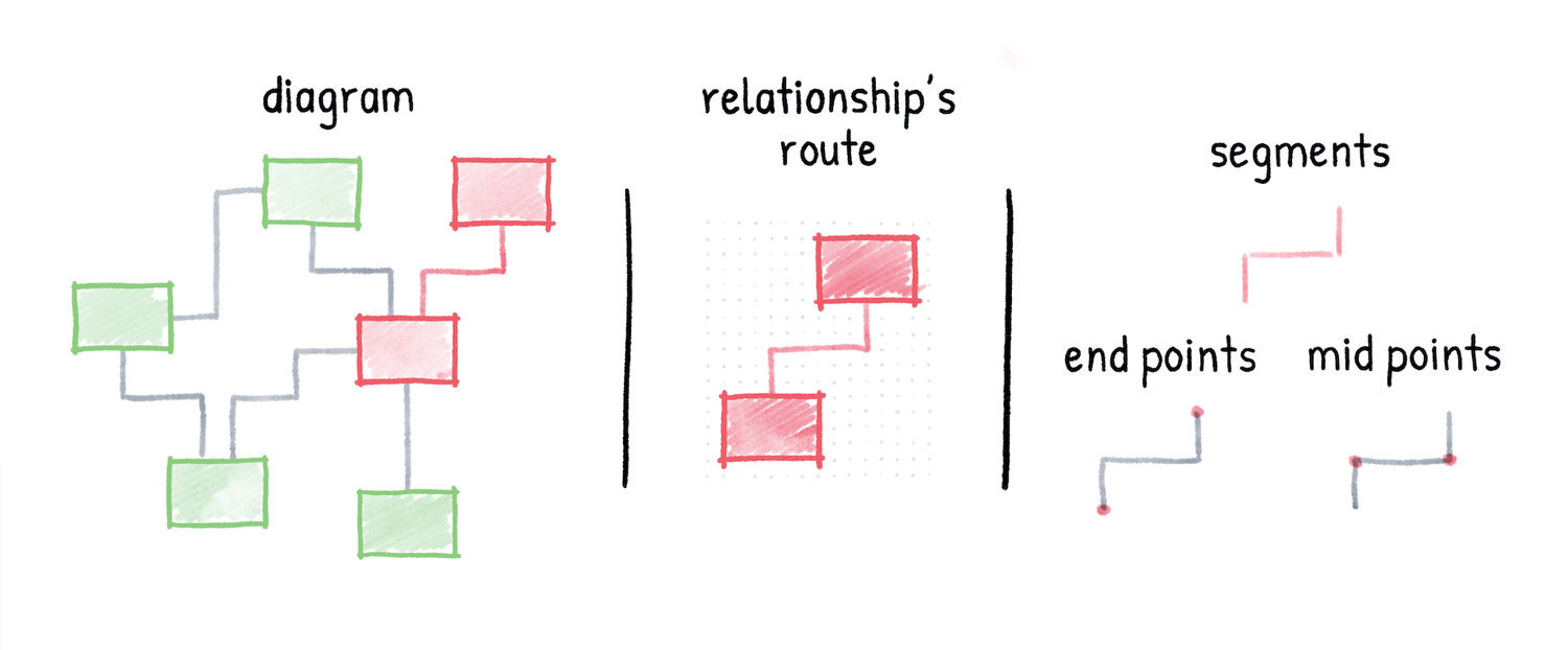
Building upon this meta-model allows for interactions which are leveraging the specifics of elements and relationships. Among other things, this means that relationships stay connected to elements when moved.

Zero Distractions

Here is what we have figured out: Most tools out there are packed with tons of features. They attempt to support as many individual options and special use cases as possible. In our eyes, these are nothing but distractions. They keep you from focusing on the content of your diagram.

Even worse, those features create room for fiddling around with fine configurations of pixel sizes, layouts, colors, fonts, and so on. Although these settings are useful for graphic designers, they are certainly useless when creating structured diagrams.

This is the reason why Diagrams has no inspector pane on the right side of the application window, leaving more space for the canvas and therefore for your focused work. It’s almost like drawing on a paper.

Rethought Workflow

A lot of effort was put into designing the diagramming workflow right from the beginning of the development. For us, workflow optimization is all about speed, intuitive interactions, and standardization.

Canvas

We truly believe in the visual nature of diagramming as we think that automatic generation of diagrams can never reach the same quality level as a human can produce. This is why an interactive canvas plays an essential role in the diagram creation process. The canvas is the entry point into the application and we’ve equipped it with streamlined interactions to make diagram editing a joy.

Furthermore, the canvas leverages a grid which simplifies the layout as it is used to align the elements and relationships in the diagram. It prevents you from losing focus by fiddling with alignments and size adjustments. This feature is so essential that it sits at the core of the application and it is reflected in most canvas interactions.

There is also no need to set the size of your diagrams manually. Just grow them as big as your structures demand. Diagrams has an infinite canvas which will adapt to the size of your diagram.

Semantics

Diagrams follows a, what we call, “creational approach”. This means that instead of applying random visual attributes to generic shapes you pick the types for your elements and relationships from a palette at the time of their creation. Each type defines the visual attributes which leads to ensured consistency among all its instances.

palettes.png

This might sound like a minor change but it’s actually a deal breaker as this approach allows working in a semantic manner. When working on a diagram of a particular type the palette would show only the relevant element and relationship types from which you can choose. So if you are creating a class diagram, for example, you’re actually adding a class element and an inheritance relationship instead of a rectangle with a text field and a line with a non-filled arrowhead.

Native Application

Last but not least we believe that only native applications can deliver the user experience you deserve. We don’t compromise in this regard and therefore we’re building a native application which feels at home on macOS.

Stay Tuned!

Hopefully, we could illustrate that we’re doing everything we can to help your brain stay focused while removing clutter at the same time. That’s how we understand the user experience.

There is more to show. We can’t wait to share some more in-depth insights with you during the next months. The further we are in development, the more details we will be able to talk about.

But for now, let’s get back to Xcode.

Hello World!

Hi there, this is Lukáš.

I’m the founder and developer of Diagrams, an upcoming Mac application for creating structured diagrams. In this post, I’d like to introduce you to this project which I have dedicated my life to for the last few years.

I came into software development in one of the weirdest ways possible: Before I started programming, I taught myself UML, the visual modeling language for describing software systems. Despite the controversy about the usefulness of UML and the processes it is usually connected to, I saw greater value in its way of visual representation.

Since I’m a visually oriented person, I still do a lot of drawing when developing software nowadays. This helps me to structure my ideas and possibly to come up with better architectures in the end.

 
uml-diagram-paper.png
 

As I was looking for a digital solution which would support my workflows on the Mac, I wasn’t able to find any suitable applications.

The UML editors supported the logic, but looked really crappy, and were overloaded with tons of unnecessary features.

The vector graphics editors, on the other hand, were not designed with the logic in mind. I had to fight the features specific to graphics editing as well as the flexible formatting and layout possibilities.

These tools were too complex for my needs. I wanted something as simple as a plain paper with all the benefits of the digital world. This is why I decided to build it myself. In the form of a truly native macOS application.

MacBook+Pro.jpg

Currently, the app is under development. The core architecture of the app is finished and a few internal alpha versions were already released. But there is still plenty of work to be done. You can expect the private release to come out next year.

Over the next weeks, we will reveal more details about Diagrams on this blog. We will explain where it tries to innovate and improve on the existing tools. We will share further concepts, show off some bits from the design process, and discuss individual features.

If you’re interested in these topics you should read this blog, subscribe to our mailing list, or follow us on Twitter.

Stay tuned!
Lukáš